Viewing entries tagged
Virginia events

From Then to Now: TEDxCharlottesville

From Then to Now: TEDxCharlottesville

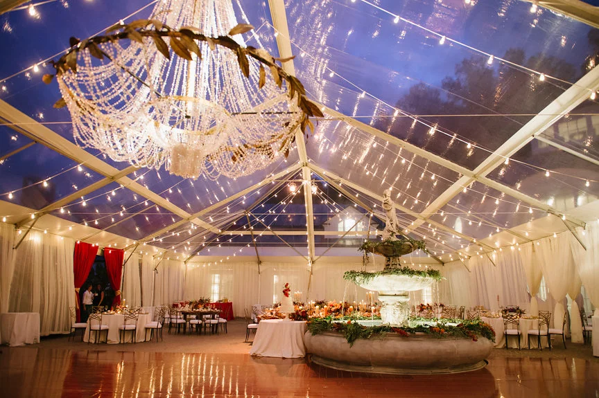
There are some events, conferences, & festivals in our portfolio that we are lucky enough to get to work on as they develop from year to year. One of our favorites is our local TEDxCharlottesville event! This is such an important event in our community and the speakers are always top-notch, so it's a welcome annual challenge to design an interesting stage set that serves this event's functions while helping to enhance the theme or underlying tone of the day's presentations.

TEDxCharlottesville staging through the years 2013a.jpg


2013

For TEDxCharlottesville's first year, we kept the staging rather minimalist & clean. This was our first go at projection mapping, so we went with some simple vertical rectangles to project content onto, and splashed colorful lighting onto the backdrop to create an engaging tableau.

TEDxCharlottesville staging through the years 2013b.jpg
TEDxCharlottesville staging through the years 2013c.jpg


2014

The next year, we took the projection mapping up a notch, using Wafer panels from Atomic Design to fill the stage and create a showstopping, high-impact backdrop. Jonah Tobias, a local animator & leader of the TEDxCharlottesville design committee, created beautiful projection content that complemented the tone of each talk.

TEDxCharlottesville staging through the years 2014a.jpg
TEDxCharlottesville staging through the years 2014b.jpg
TEDxCharlottesville staging through the years 2014c.jpg
 
TEDxCharlottesville staging through the years 2015a.jpg


2015

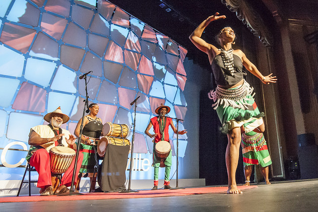
In its third year, we took a nod from the poster artwork, creating a more literal representation of the event's branding. We built custom set pieces from pipe and acrylic shapes, onto which we projected the speakers faces along with ambient content. We also used three projection screens to accommodate speaker content while keeping informational slides visible during each talk.
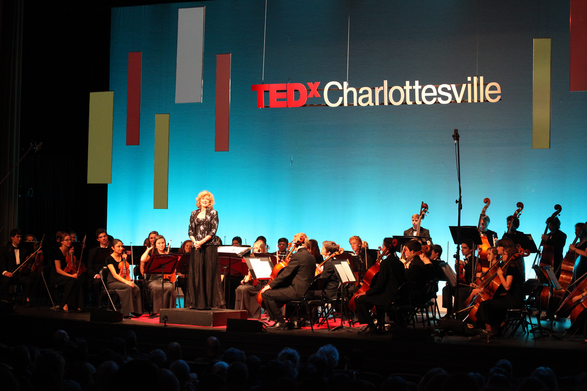
TEDxCharlottesville staging through the years 2015c.jpg
TEDxCharlottesville staging through the years 2015b.jpg


2016

In 2016, we switched it up and used our Absen LED panels instead of projection & screens. We placed one large LED wall with picture-in-picture graphics in the center of the stage, and used additional LED panels to construct realistic-looking "wooden" stage decor.
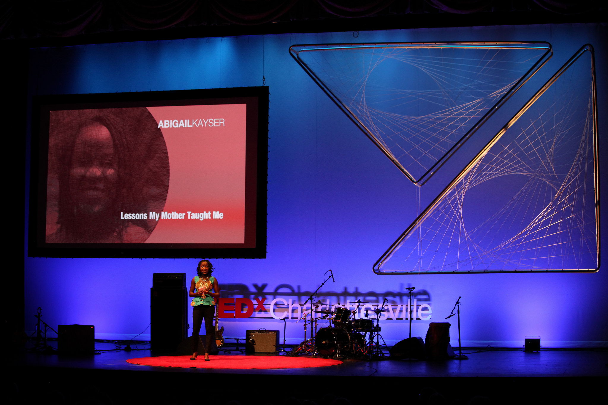
TEDxCharlottesville staging through the years 2016a.jpg
TEDxCharlottesville staging through the years 2016b.jpg
TEDxCharlottesville staging through the years 2016c.jpg
 
TEDxCharlottesville 2017 (Edmond Joe)3.jpg


2017

Finally, this year we went back to basics with a single projection screen and two analog sculptural set pieces. The structure of the set pieces was an exact replication of this year's branding illustrations, and the pieces made a strong statement among an otherwise pared-down stage set.

TEDxCharlottesville staging through the years 2017b.jpg
TEDxCharlottesville staging through the years 2017c.jpg

We're honored to have assisted with this event since its inception, and our long-standing relationship & close connection to the show allow us to create innovative sets while maintaining a thread of stylistic continuity from year to year.

Ten Powerpoint Tips

Ten Powerpoint Tips

Summer is in full swing, and we are starting to plan for our fall conferences! For those of you working on your own conferences and meetings, we thought we might put together a few pointers for constructing great presentation visuals.

We've compiled a list of Ten PowerPoint Tips to assist you when putting together your next presentation!  Here's a sneak peek...

Use a 16:9 aspect ratio to completely fill the screen. In versions of Powerpoint prior to 2013, the default is set to a Standard 4:3 ratio. If you need assistance in reformatting your slides to a 16:9 ratio, give us a call and we would be happy to h…

Use a 16:9 aspect ratio to completely fill the screen. In versions of PowerPoint prior to 2013, the default is set to a Standard 4:3 ratio. If you need assistance in reformatting your slides to a 16:9 ratio, give us a call and we would be happy to help.

The minimum font size for any important text on a slide should be 14 point. If the text is smaller than that, it may not be legible for the entire audience.

The minimum font size for any important text on a slide should be 14 point. If the text is smaller than that, it may not be legible for the entire audience.

Lighter text colors show up best over dark backgrounds, and vice versa. The closer the text color is to the background color, the harder it will be to read.

Lighter text colors show up best over dark backgrounds, and vice versa. The closer the text color is to the background color, the harder it will be to read.


To get the rest of our Powerpoint guide, sign up for our newsletter below and we'll send it right to your inbox!


Through the Years

Through the Years

ten-year-anniversary-infographic.jpg

Header photo c/o Jen Fariello