

Lighting plays a large part in all of our events, and color is one of our favorite tools to use in shaping the ambience of a space. One often hears color theory discussed in terms of graphic design or interior decorating, but it is equally relevant to event design!
Color theory is a term used to describe the collection of rules and guidelines regarding the use of color in art and design. Essentially, because color affects our emotions in predictable and quantifiable ways, color theory aims to help us understand the emotions & perceptions associated with each color. In event design, we can use color to evoke certain emotions in our attendees, so an understanding of color theory is crucial!
Here are some examples of ways we’ve utilized color theory in the past:
RED
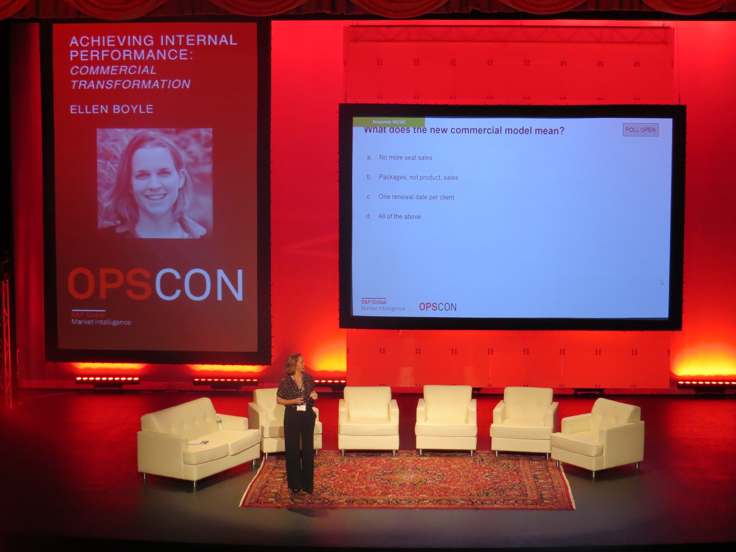
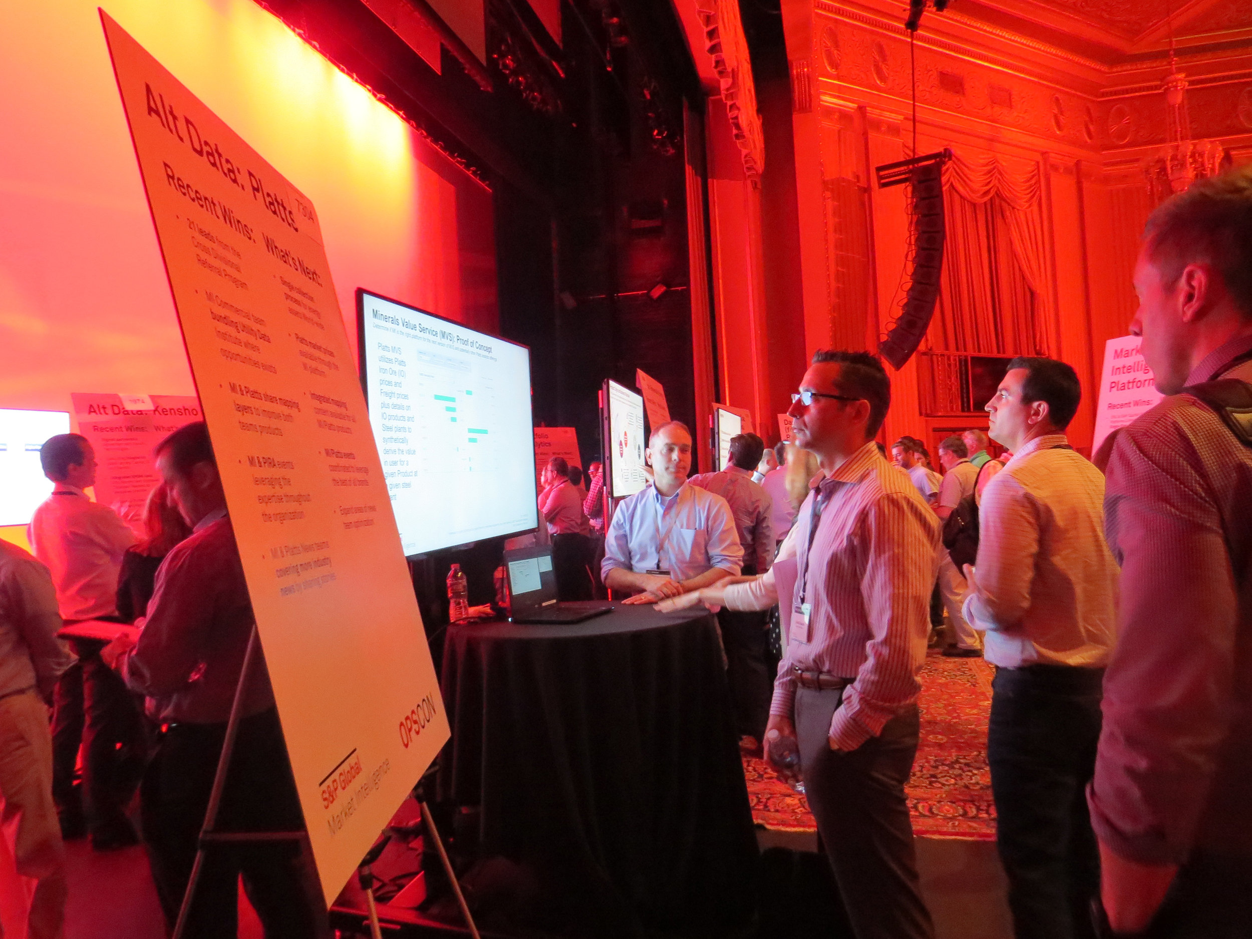
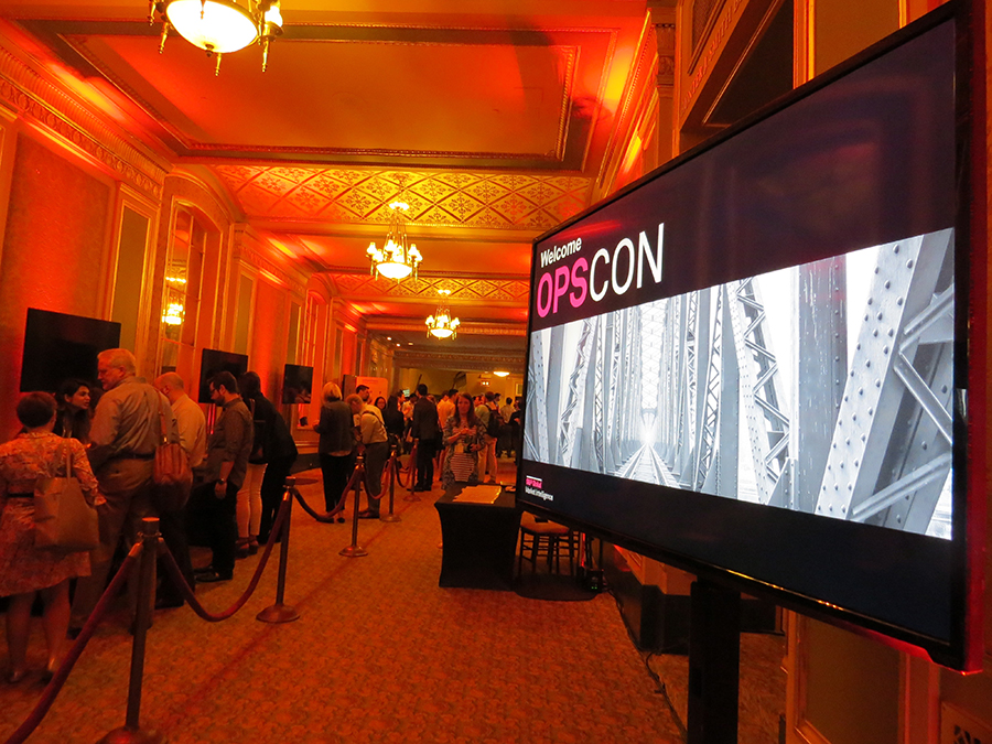
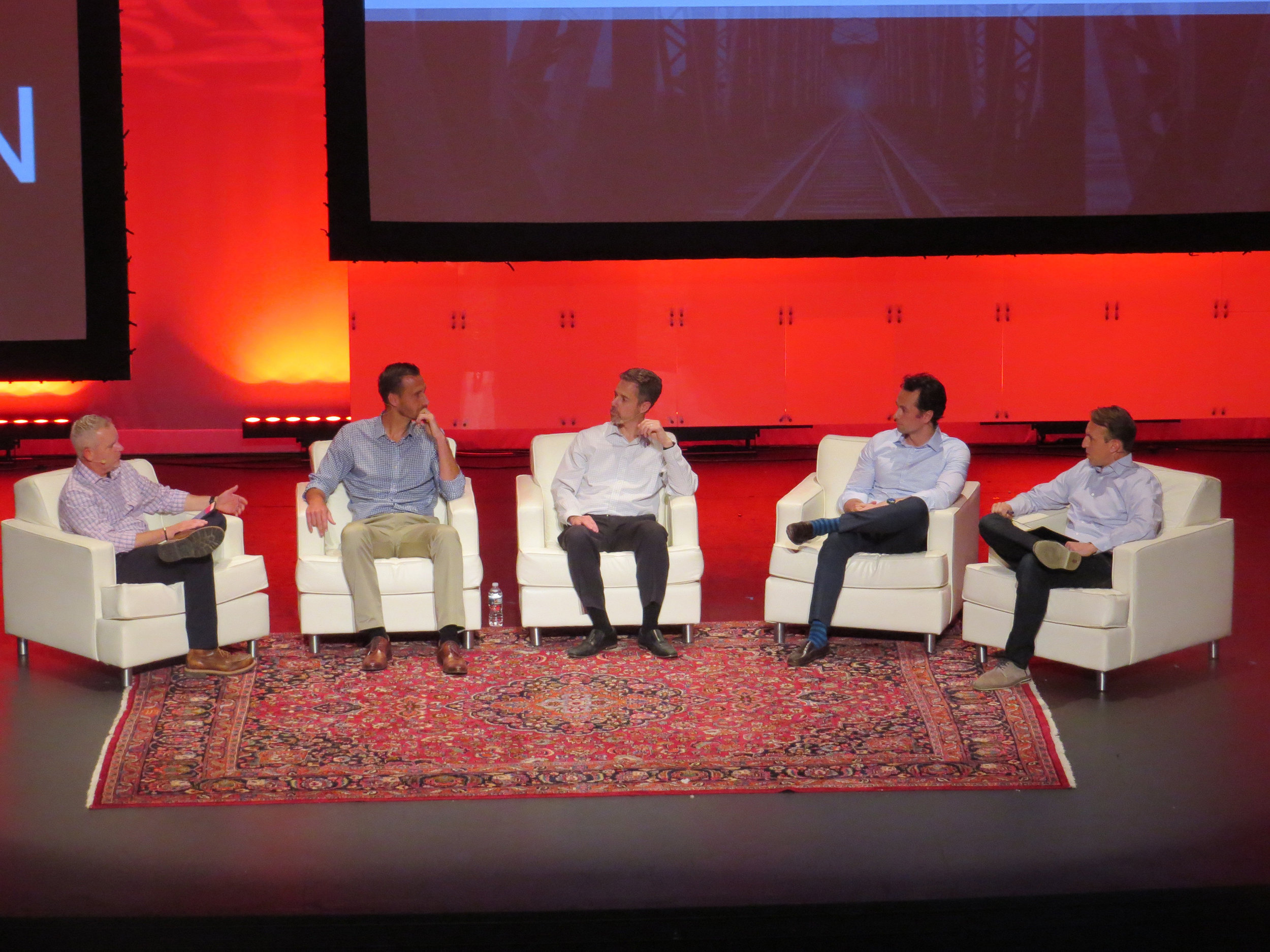
For S&P’s OPSCON conference a couple of years ago, we used red as the primary color for stage lighting. This was in part because red is one of S&P Global’s primary branding colors, but also because red can often heighten energy levels in the viewer. Red is often associated with excitement, passion, and power, and for a multi-day conference like OPSCON, keeping attendees excited and engaged was crucial!
Common RED connotations: Intensity, determination, excitement, passion, aggression, power

BLUE
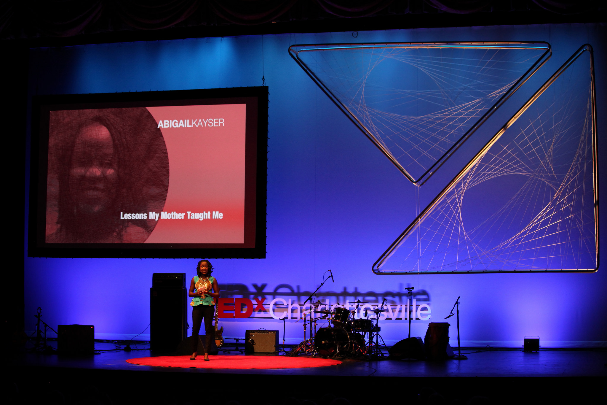
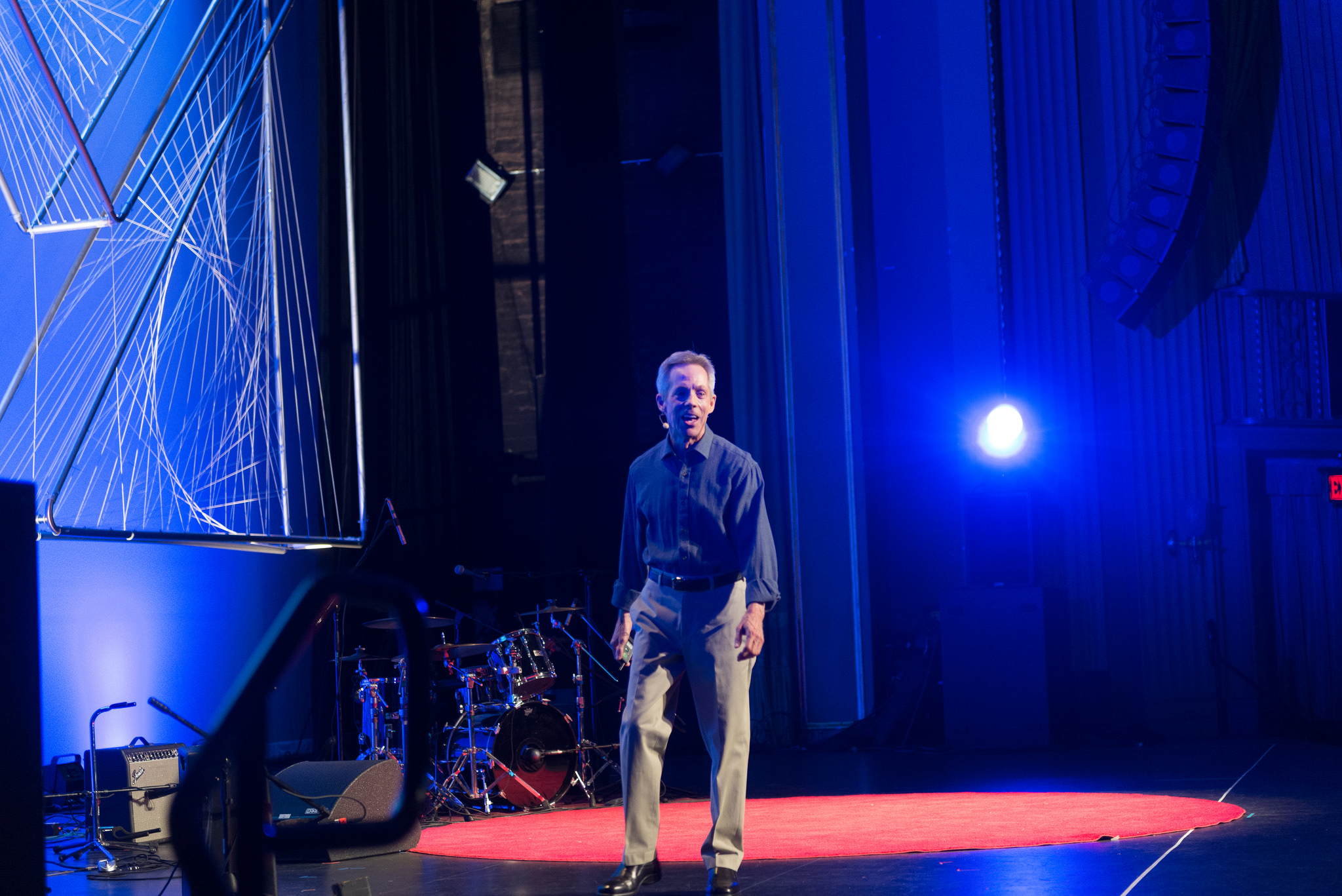
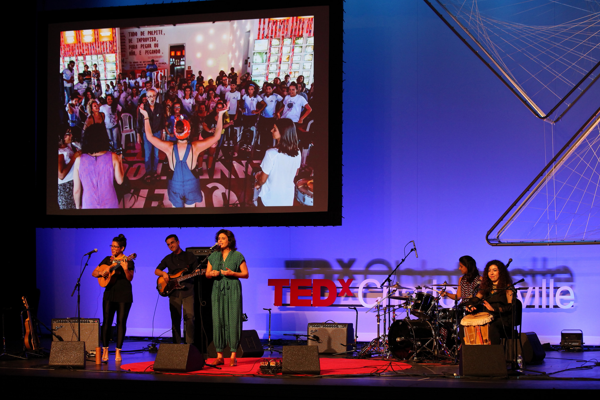
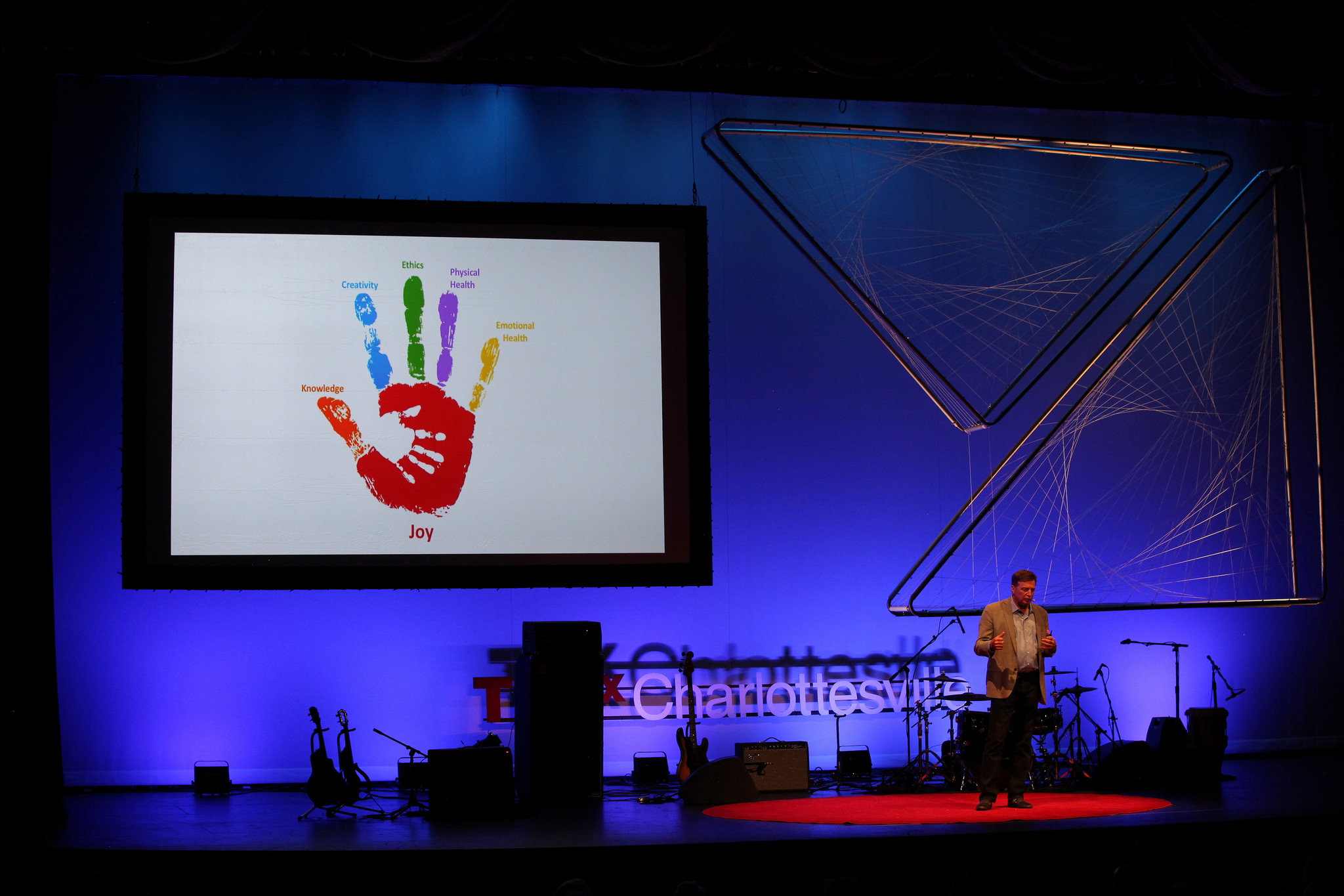
For last year’s TEDxCharlottesville, we used a blue background wash as a primary staging element throughout most of the event. TEDxCharlottesvile is an event in which speakers come together to share ideas and to bring awareness to the rich talent, creativity and innovation found here in Charlottesville, Virginia. This year’s branding did not dictate a strict color palette, so we chose blue for our staging as it enhances a sense of intelligence, wisdom, trustworthiness, and creativity.
Common BLUE connotations: Calm, soothing, trust, loyalty, confidence, intelligence, peacefulness, wisdom, creativity
GREEN
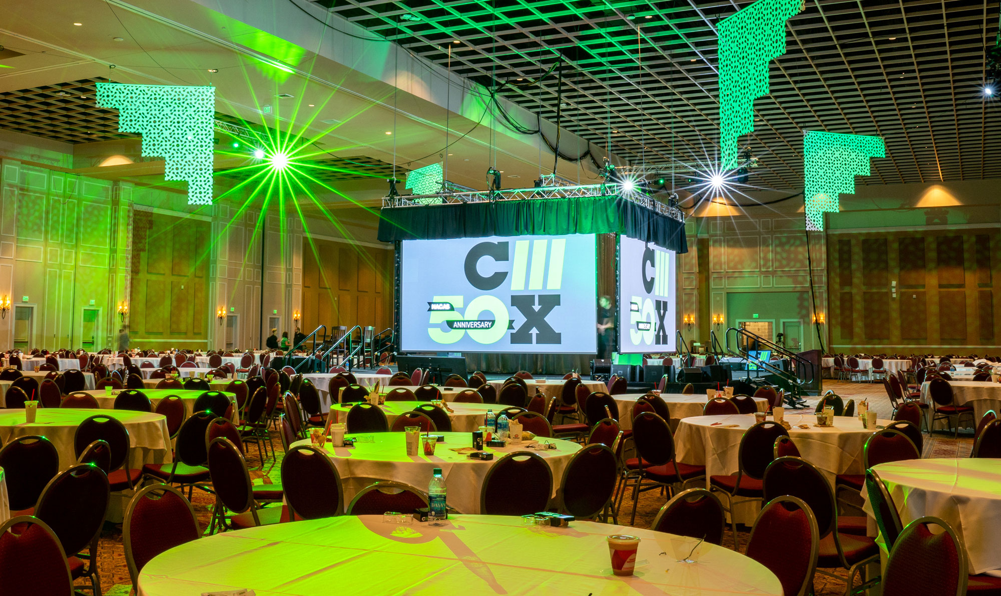
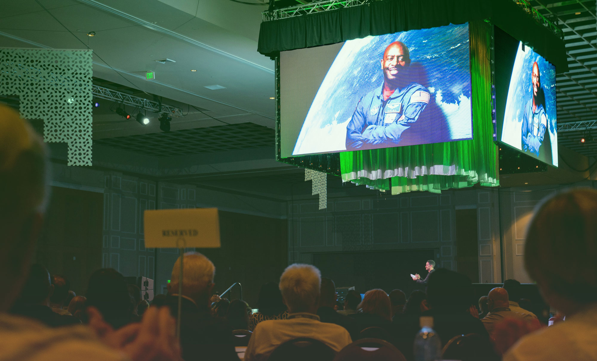
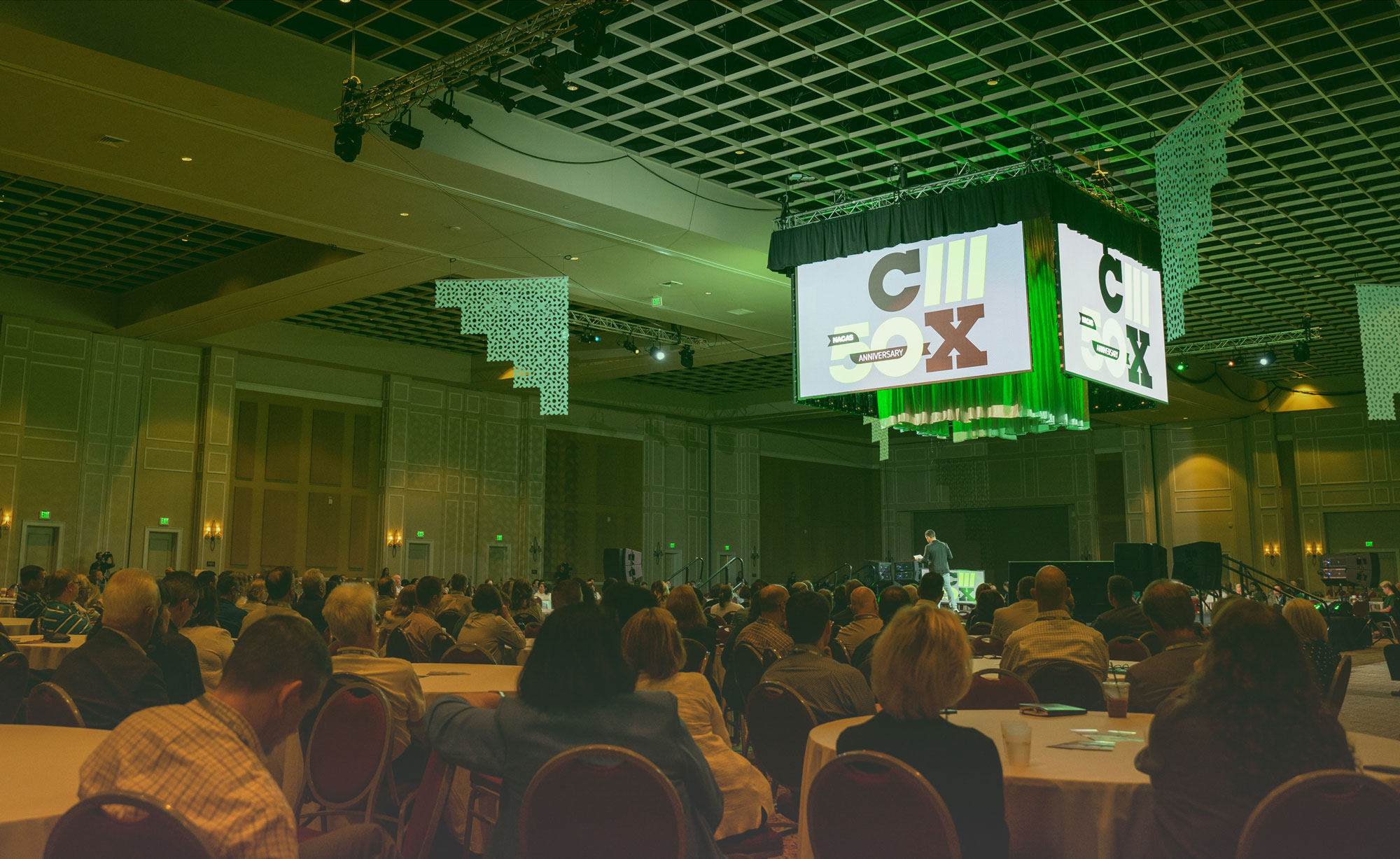
For the NACAS C3X Conference - one of our more recent projects this fall - we used green lighting to add ambience to the event space. Again, this is one of NACAS’s branding colors, but it also enhances a sense of intrigue and originality. Green is often associated with invention and renewal, which is in line with the event’s focus on showcasing the most contemporary perspective of how auxiliary services enrich the campus experience, and it is also associated with financial abundance, which appeals to the target attendee who is there to expand upon their professional skills & knowledge.
Common GREEN connotations: Logic, invention, renewal, luck, abundance, wealth, organicism, health
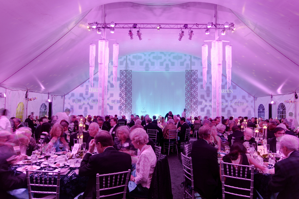
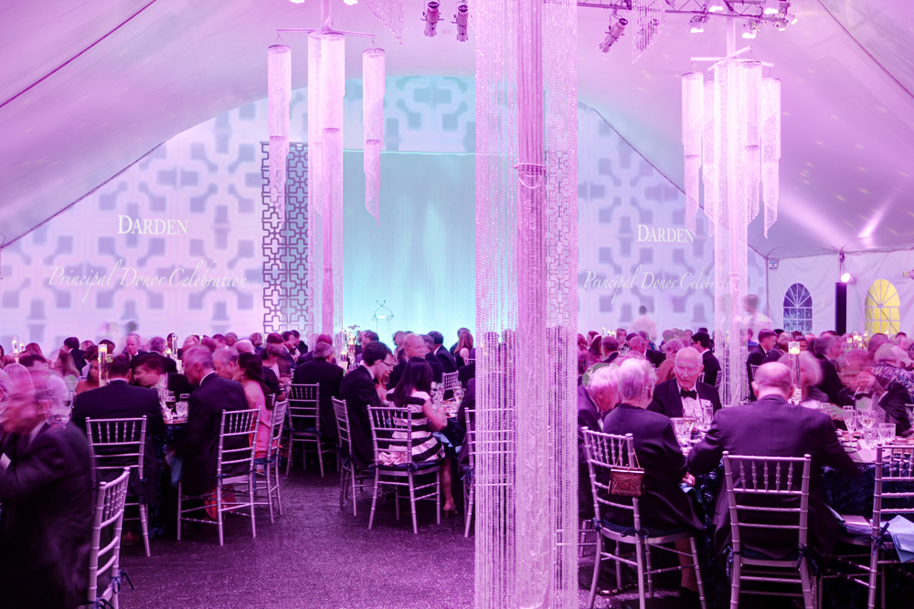
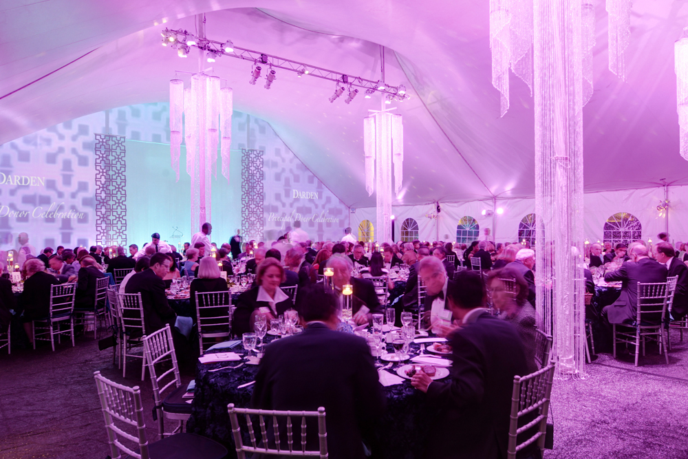
PINK
For Darden’s Principal Donor event in 2014, lighting played a huge part in the overall look & feel of the space. We chose a pink color to splash throughout the tent to provide a playful but soft look. In Western culture, pink is sometimes associated with femininity - but its connotations go far beyond that. It adds warmth & energy to the space, but because it is light in color, it still allows the space to feel light and airy.
Common PINK connotations: Softness, harmony, calm, innocence, optimism, gentleness
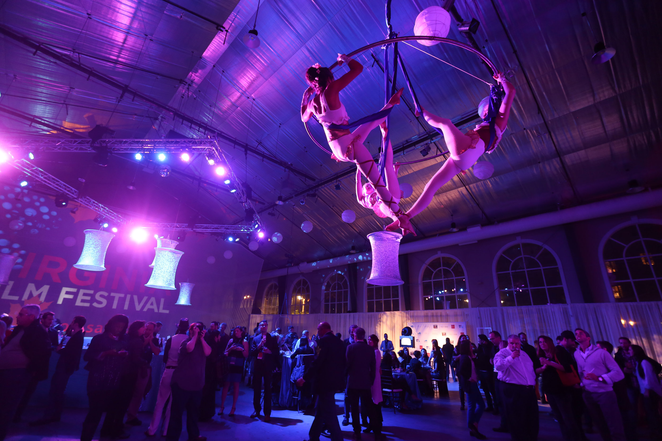
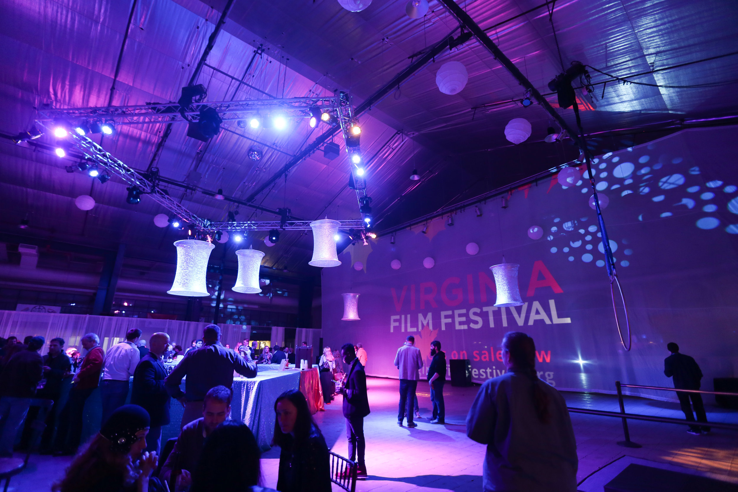
PURPLE
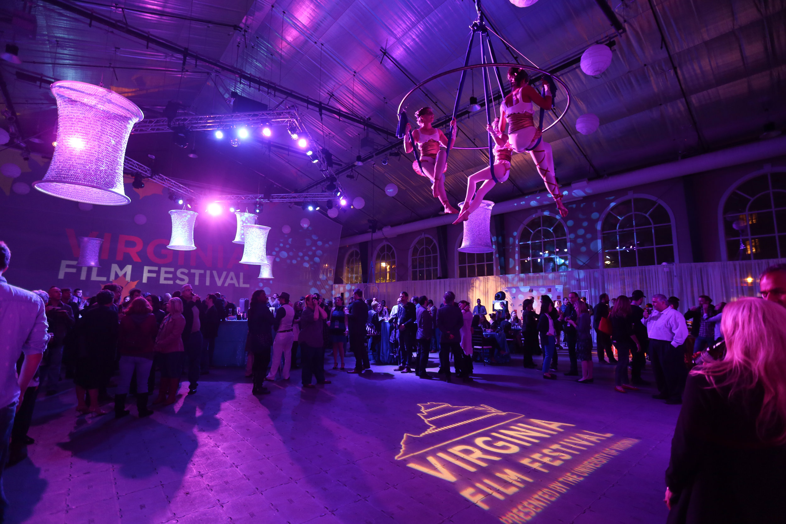
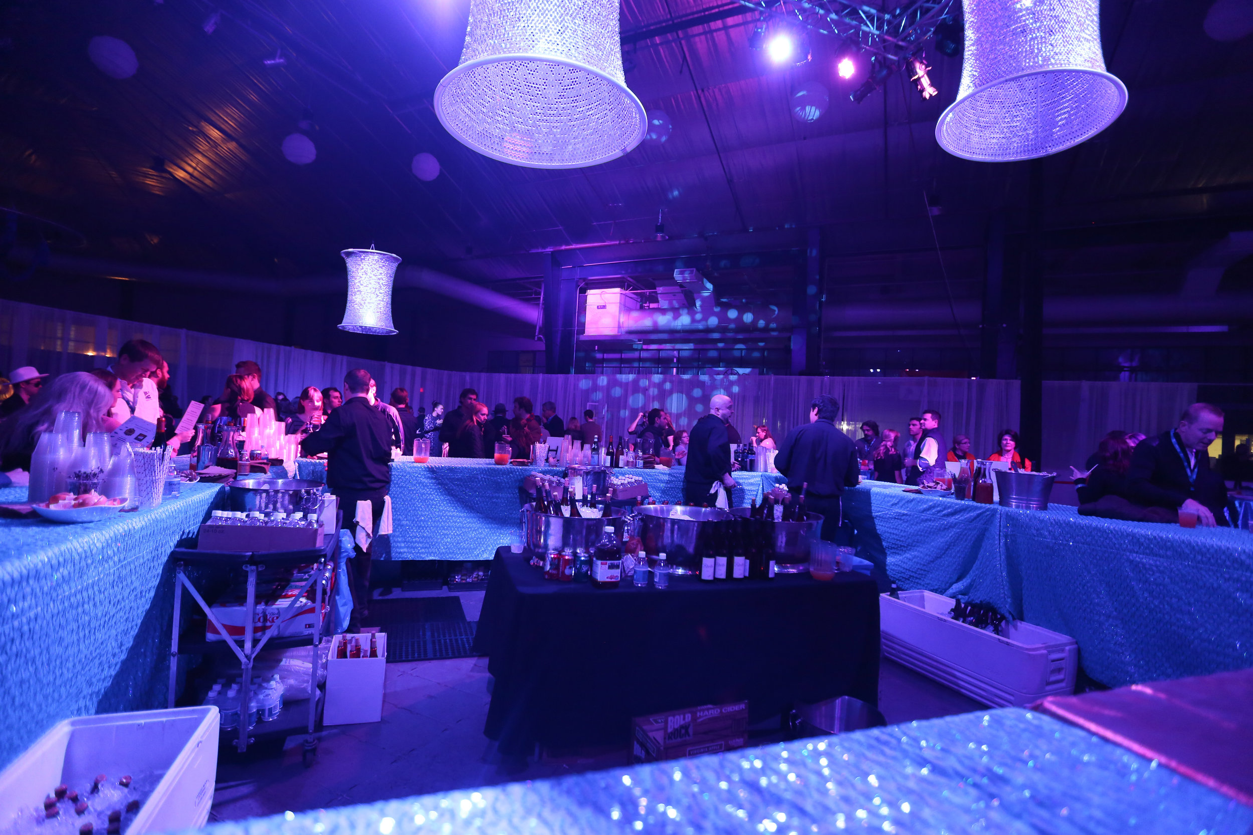
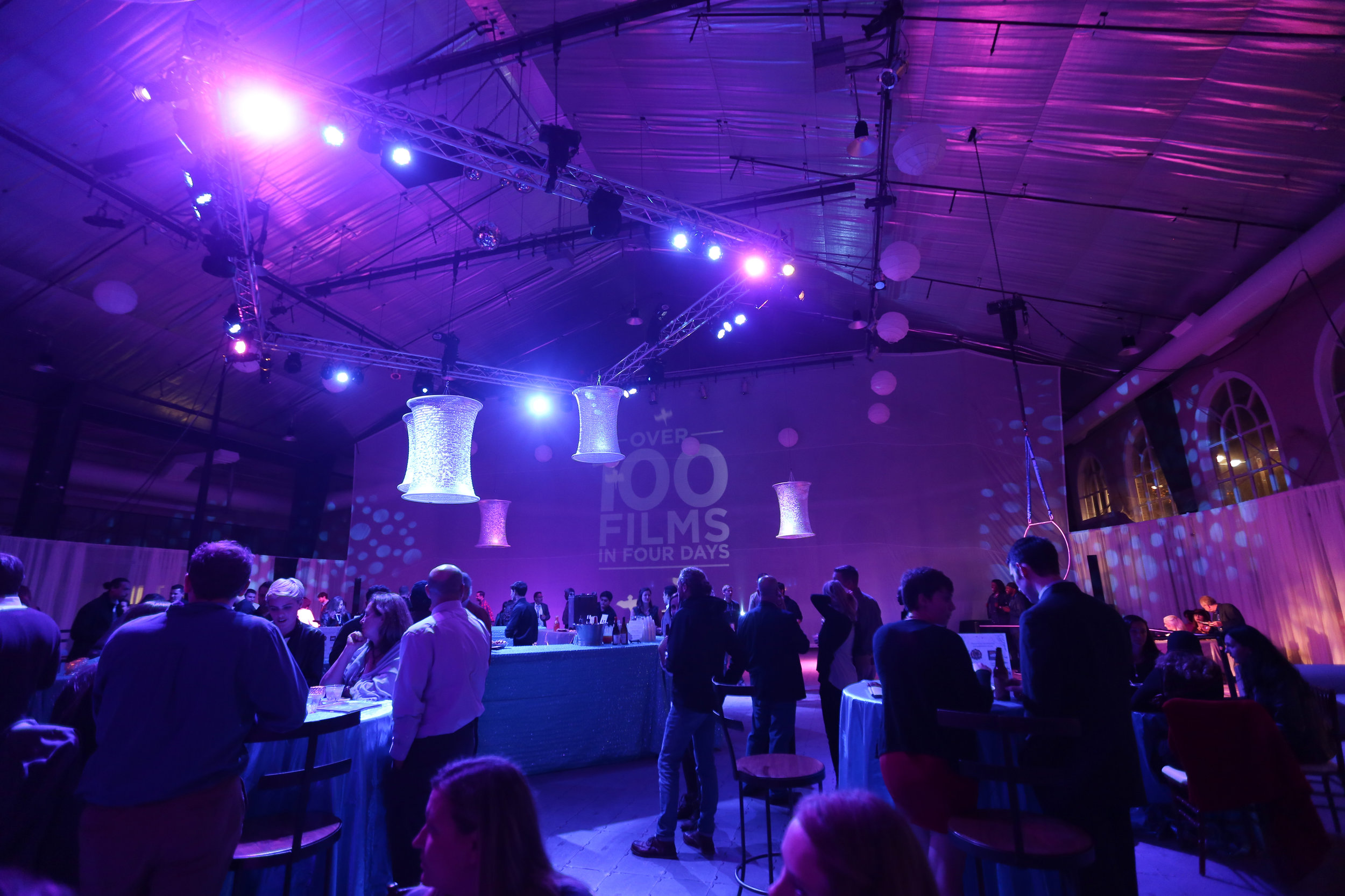
We utilized purple lighting for the Virginia Film Festival’s Wrap Party a few years back to enhance the event theme. This event was meant to feel whimsical and mysterious, a mood which was heightened by performances from aerial dancers throughout the event. So, combined with copious amounts of fog & atmosphere, we used purple as our primary lighting color to enhance feelings of imagination, mysticism, and playfulness.
Common PURPLE connotations: Spirituality, courage, opulence, respect, imagination, luxury, magic, dignity, peace, truth
OTHER COLORS & THEIR CONNOTATIONS
Orange: Strength, playfulness, enthusiasm, creativity, success, cheerfulness, optimism
Yellow: Energy, intensity, intellectualism, warmth, happiness
Sepia: Nostalgia, comfort, stability
White: Cleanliness, modernity, freshness, youth, simplicity, spaciousness, calm
Color can play a huge role in determining the look and feel of an event space or stage. Harnessing the power of color theory can help you to make more informed decisions when selecting colors to use throughout your event, whether its in lighting, decor, or even event branding.